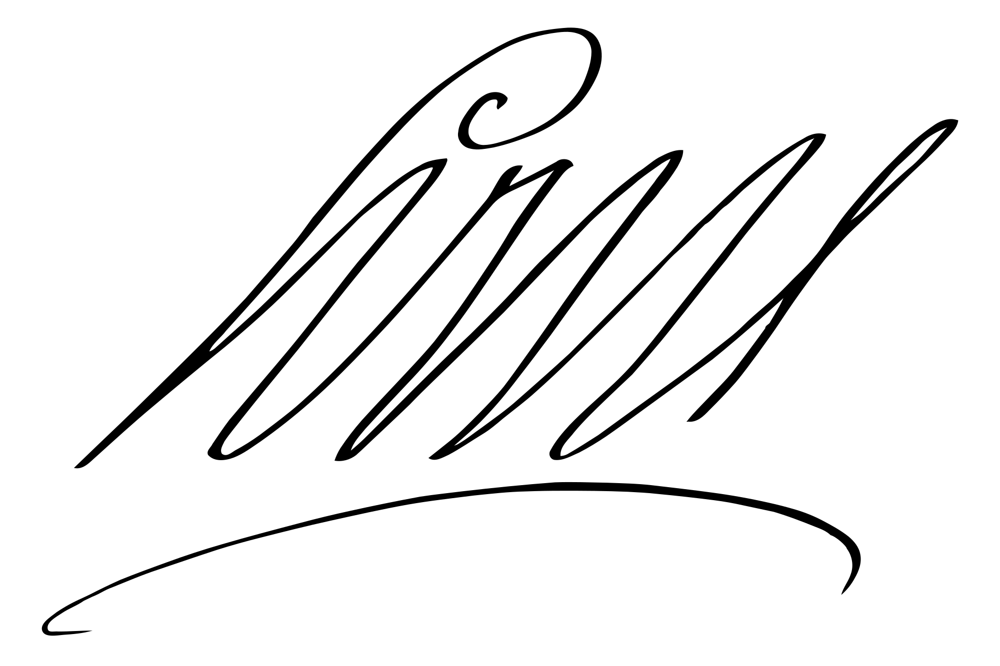
Louis XIV of France signature
This royal specimen writes Louis with tall fine inclined forms.
What does Louis XIV of France’s signature look like?
This royal specimen writes Louis with tall fine inclined forms. A rounded upper opening leads into repeated narrow strokes, above a separate broad arc beneath the name. Compare that shallow lower curve with the much taller upper band: the autograph’s outline combines a vertical single name and a more horizontal surrounding gesture.
- Slant
- +39°forward
- Baseline
- +2.9°rising
- Width / height
- 1.51 : 1overall proportions
- Opening height
- 0.55×opening versus body letters
About Louis XIV of France and this autograph
Louis XIV of France (5 September 1638 – 1 September 1715) was the king of France and Navarre from 1643 to 1715. Louis XIV of France held citizenship in the Kingdom of France. This specimen is the Wikimedia Commons vector rendering of Louis XIV of France’s signature.
Louis XIV of France signature and handwriting analysis
Louis XIV of France’s signature sample has 39° of forward slant, a rising baseline and 0 enclosed loops. Comparing autograph strokes, baseline angle (+2.9°), slant (+39°), opening ratio (0.55×) and enclosed loops (0) reveals how individual signature traits contrast with standard handwriting features. Use the layers to follow the writing line, letter band, slant and enclosed loops.
- Slantforward
- +39°
- Baselinerising
- +2.9°
- Width / heightoverall proportions
- 1.51 : 1
- Opening heightopening versus body letters
- 0.55×
- Enclosed loopsclosed spaces in the image
- 0
- Ink groupsmain disconnected groups
- 2
- Ink densityinside the signature bounds
- 7.8%
- Underlinelower flourish
- 47% of width
- Finish heightrelative to the letter body
- +1.02×
Opening, letter body and finish
The opening is lower than the typical letter body. The opening-to-body ratio is 0.55×, while the whole image is 1.51 times as wide as it is tall. The rightmost ink finishes above the writing line; look at this ending separately from the slant of the letters themselves.
Loops and the lower flourish
The sample contains 0 enclosed loops and 2 main ink groups. The lower flourish spans about 47% of the full ink width, giving the name another line to follow beneath its letters.
All 11 measured signature features
Slant
+39°Angle of the letter strokes from vertical. Positive angles lean right; negative angles lean left.
The signature has a forward slant (+39°). The blue-green guides show the lean of strokes across the name.
Baseline
+2.9°Direction of the writing line from the beginning to the end of the signature.
The writing line rises (+2.9°). The red guide follows the base of the letters, separate from lower loops and flourishes.
Opening capital
0.6×Height of the opening letter relative to the typical letters that follow. 1× means similar heights.
The opening stands 0.6 times as high as the following letters. The purple box marks its area; the dashed blue guide marks the letter-body band.
Enclosed loops
0Closed spaces surrounded by ink, counted across the whole signature.
No enclosed loops are detected. Compare the open curves and joined strokes in the sample.
Ink groups
2Separate connected areas of ink in the image. Dots or detached letters can form additional groups.
The signature contains 2 main ink groups. The visible ink is divided into separate shapes. Look at where those shapes join or separate.
Ink density
8%Share of the signature’s enclosing rectangle occupied by ink.
Ink covers 8% of the measured signature area; the rest is open space. Compare the open areas with the thickness of the visible strokes.
Underline / flourish
47% wideLength of a lower underline or flourish compared with the full signature width.
A lower underline or flourish spans about 47% of the name’s width. Its highlighted area shows how much emphasis sits beneath the letters.
Finish height
+1.0×Height of the rightmost ending above or below the baseline, in typical letter heights. Positive is above; negative is below.
The ending sits high above the writing line (+1.0 letter heights). The orange guide locates the finish relative to the red baseline.
Width / height
1.5 : 1Full ink width divided by full ink height, including the signature’s tall and low strokes.
The shape is 1.5 times as wide as it is high. Its ink spans 452 × 299 image pixels. Compare the horizontal spread with the vertical reach of the capitals and loops.
Ornamentation
6.9×Total traced stroke length divided by signature width. More turns and retraced shapes add length.
The traced strokes total 3,132 pixels, about 6.9 times the signature’s width. Look for loops, turns and flourishes that add movement within that width.
Angularity
1.6Number of corners per 100 pixels of traced ink outline. Higher values indicate more frequent sharp turns.
The outline contains about 1.6 corners per 100 pixels. Inspect the turns in the pen-path layer and compare pointed changes of direction with rounded curves.
Signatures with similar shapes
Compare these samples’ slant, proportions and letter rhythm with Louis XIV of France’s autograph.